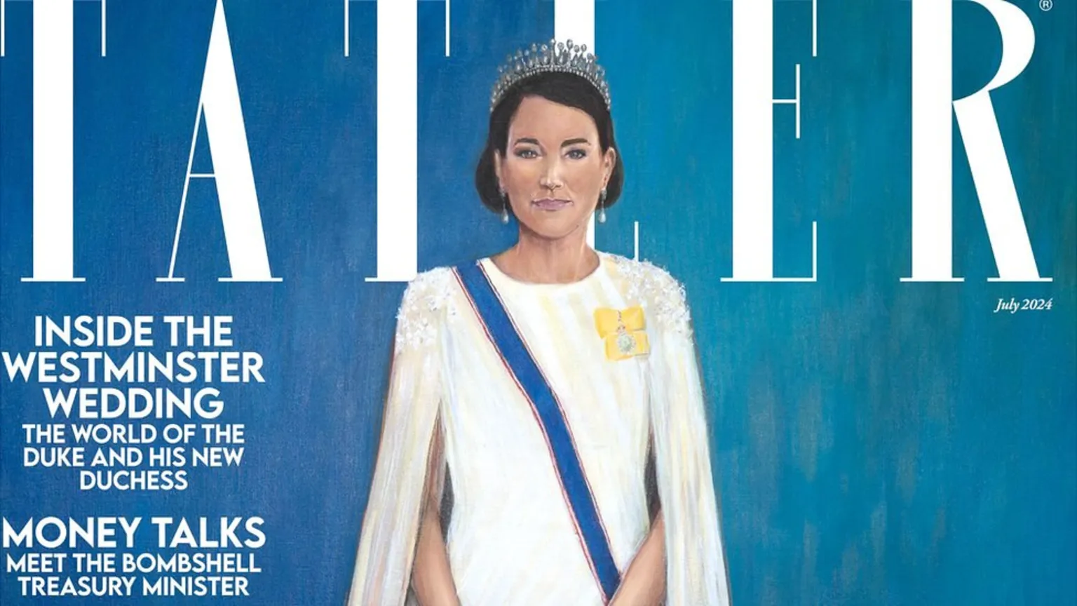
Royal fans have taken to social media to voice their doubts about a painting of the Princess of Wales.
That's probably being polite about the response to the painting, which will appear on the cover of Tatler magazine.
Among the more positive responses was that at least the dress was recognisable.
The painter Hannah Uzor said: "All my portraits are made up of layers of a personality, constructed from everything I can find about them."
Royal paintings are always likely to divide opinion - the recent red-dominated portrait of King Charles had many admire while others expected a more traditional image.
Portrait of King Charles revealed
King's official photo for public buildings
No return to work yet for princess
The latest painting of Catherine, based on photographs and videos rather an in-person sitting, drew a sceptical response from many online critics.
"It looks like a bad GCSE project!" wrote Fi on X.
"Is this a parody? Love the artist... she's very stylish... but the painting, while lovely... doesn't look like the Princess of Wales, " said Aleisha.
But the painting also had supporters. "I actually don't mind it because I don't think the painting was meant to look like the Princess of Wales in a realistic way, but more like an image we recognise to be her. To me it works, " wrote Fafo.
"Painting in whatever medium you chose isn't meant to be a photo, it's an interpretation. She has captured the princess's expression really well, " said Marie Therese.
Alastair Sooke, chief art critic of the Daily Telegraph, was less sympathetic, calling it "jaw-hits-the-floor bad".
Kate Mansey, an assistant editor at The Times, was more circumspect: "I'm not quite sure what to say about this one, except, hmm..."
Tatler described the cover with measured understatement as being of "historic magnitude" - billing the painting as a "portrait of strength and dignity".
The painter Hannah Uzor said it was "really important to capture the soul of the person" and she had tried to "get a sense of who she is".
"Colour is one of the most important things in a work of art, because it can really speak to the atmosphere, " said the painter, in a social media post that said the "bluey, turquoise" background was a reference to Catherine's green eyes.
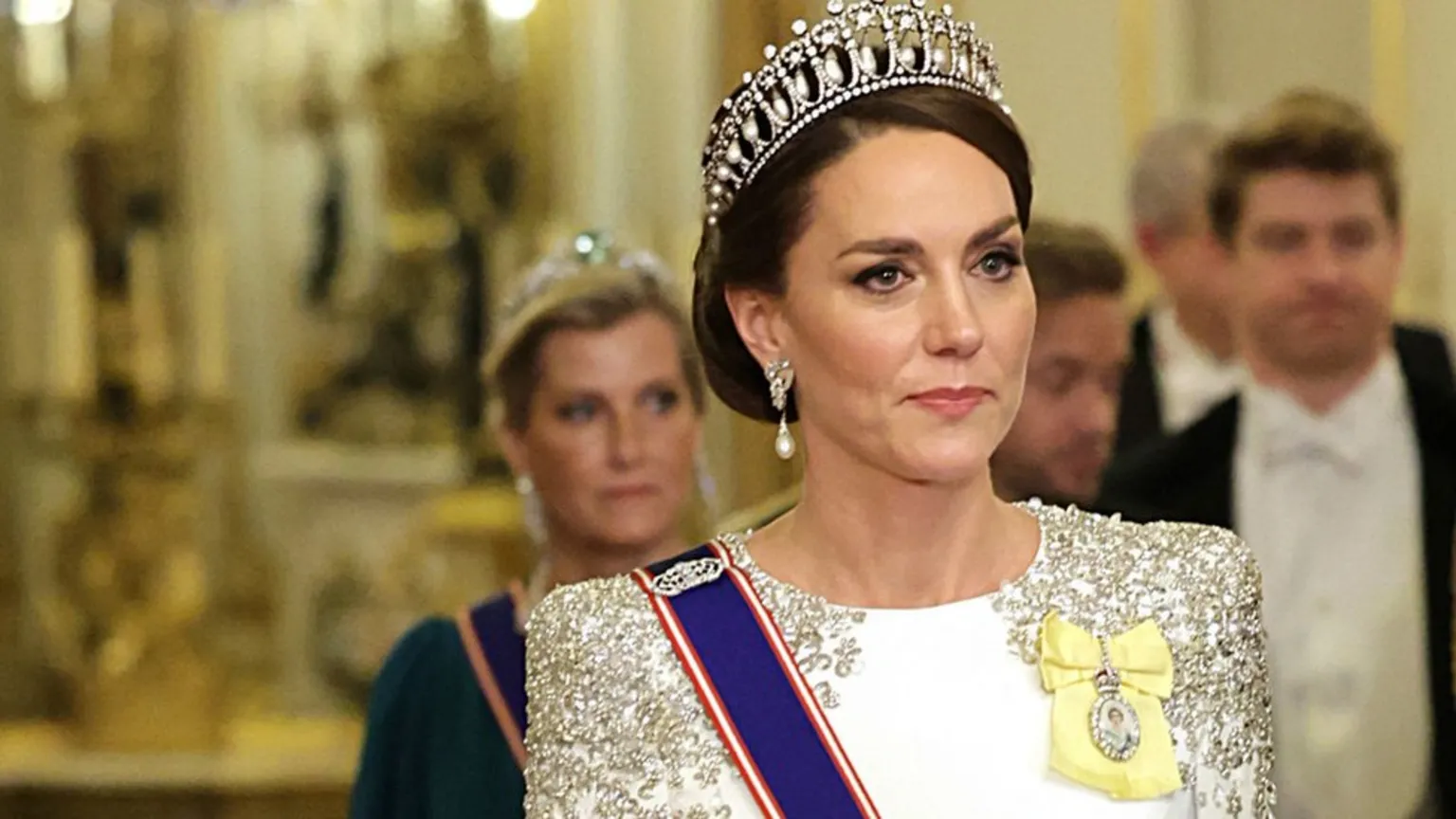
The subject of the painting remains away from public events, as she recovers after a cancer diagnosis, announced in March.
An update this week from Kensington Palace said that princess would not return to work until allowed to by her medical team.